reading-notes
This Repo required for Asac labs class 2
Project maintained by ManarAbdelkarim Hosted on GitHub Pages — Theme by mattgraham
Read: 01 - SMACSS and Responsive Web Design
Responsive web design

What is RDW?
Responsive web design is the practice of building a website suitable to work on every device, and every screen size, no matter how large or small, mobile or desktop. Responsive web design is focused around providing an intuitive and grati fying experience for everyone. Desktop computer and cell phone users alike all benefit from responsive websites.
Responsive vs. Adaptive vs. Mobile

- Responsive means to react quickly and positively to any change
- With responsive design websites continually and fluidly change based on different factors such as viewport width
- adaptive means to be easily modified for a new purpose or situation, such as change.
- while adaptive websites are built to a group of preset factors.
- Mobile means to build a separate website commonly on a new domain solely for mobile users.
Flexible Layouts
Responsive web design is broken down into three main components, including
-
flexible layouts
flexible layouts, is the practice of building the layout of a website with a flexible grid, capable of dynamically resizing to any width.Flexible grids are built using relative length units, most commonly percentages or em units. These relative lengths are then used to declare common grid property values such as width, margin, or padding.
- Relative Viewport Lengths:
vw
Viewports widthvh
Viewports heightvmin
Minimum of the viewport’s height and widthvmax
Maximum of the viewport’s height and width
### The formula is based around taking the target width of an element and dividing it by the width of it’s parent element. The result is the relative width of the target element.
target ÷ context = result
- media queries Media queries were built as an extension to media types commonly found when targeting and including styles. Media queries provide the ability to specify different styles for individual browser and device circumstances
Mobile First
One popular technique with using media queries is called mobile first. The mobile first approach includes using styles targeted at smaller viewports as the default styles for a website, then use media queries to add styles as the viewport grows.
- flexible media.
As viewports begin to change size media doesn’t always follow suit. Images, videos, and other media types need to be scalable, changing their size as the size of the viewport changes.
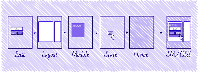
Scalable and Modular Architecture for CSS (SMACSS)
What is it?
SMACSS (pronounced “smacks”) is more style guide than rigid framework. There is no library within here for you to download or install. There is no git repository for you to clone. SMACSS is a way to examine your design process and as a way to fit those rigid frameworks into a flexible thought process. It is an attempt to document a consistent approach to site development when using CSS.
Categorizing CSS Rules
-
Base rules are the defaults. They are almost exclusively single element selectors but it could include attribute selectors, pseudo-class selectors, child selectors or sibling selectors. Essentially, a base style says that wherever this element is on the page, it should look like this
-
Layout rules
divide the page into sections. Layouts hold one or more modules together.
-
Modules
are the reusable, modular parts of our design. They are the callouts, the sidebar sections, the product lists and so on.
-
State rules
are ways to describe how our modules or layouts will look when in a particular state.
-
Theme rules
are similar to state rules in that they describe how modules or layouts might look. Most sites don’t require a layer of theming but it is good to be aware of it.
Naming Rules
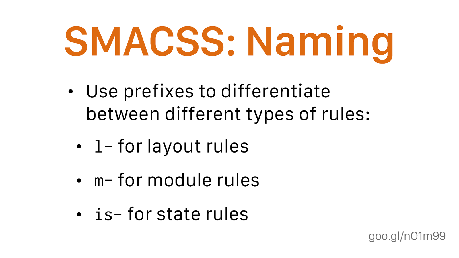
By separating rules into the five categories, naming convention is beneficial for immediately understanding which category a particular style belongs to and its role within the overall scope of the page.
-
For styling grid use grid as prefix Eg:class=”grid-serviceList1.
- For styling layout use layout as prefix Eg: HTML : class=”layout-primary”.
-
for theming use theme as prefix CSS: .theme-header {}.
- for state use is as prefix CSS: .is-active {}, .button-is-active {}
FLOAT
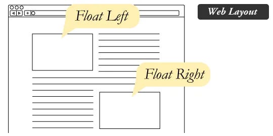
what is Float
Float is a CSS positioning property. To understand its purpose and origin, we can look to print design. In a print layout, images may be set into the page such that text wraps around them as needed. This is commonly and appropriately called “text wrap”.
Clear
Clearing the Float Float’s sister property is clear. An element that has the clear property set on it will not move up adjacent to the float like the float desires, but will move itself down past the float.
If you are in a situation where you always know what the succeeding element is going to be, you can apply the clear: both;
Float & Overflow
The Overflow Method relies on setting the overflow CSS property on a parent element. If this property is set to auto or hidden on the parent element, the parent will expand to contain the floats, effectively clearing it for succeeding elements. This method can be beautifully semantic as it may not require additional elements. However if you find yourself adding a new div just to apply this, it is equally as non-semantic as the empty div method and less adaptable. Also bear in mind that the overflow property isn’t specifically for clearing floats. Be careful not to hide content or trigger unwanted scrollbars.
The Easy Clearing Method uses a clever CSS pseudo selector (:after) to clear floats. Rather than setting the overflow on the parent, you apply an additional class like “clearfix” to it. Then apply this CSS:
    .clearfix:after {
      content: ".";
      visibility: hidden;
      display: block;
     height: 0;
     clear: both;
    }
This will apply a small bit of content, hidden from view, after the parent element which clears the float. This isn’t quite the whole story, as additional code needs to be used to accommodate for older browsers.
Problems with Floats
- Pushdown
Pushdown is a symptom of an element inside a floated item being wider than the float itself (typically an image). Most browsers will render the image outside the float, but not have the part sticking out affect other layout. IE will expand the float to contain the image, often drastically affecting layout.
QUICK FIX Make sure you don’t have any images that do this, use overflow: hidden to cut off excess.
- Double Margin
Double Margin Bug – Another thing to remember when dealing with IE 6 is that if you apply a margin in the same direction as the float, it will double the margin.
Quick fix: set display: inline on the float, and don’t worry it will remain a block-level element.
- The 3px Jog
The 3px Jog is when text that is up next to a floated element is mysteriously kicked away by 3px like a weird forcefield around the float.
Quick fix: set a width or height on the affected text.
- IE 7
the Bottom Margin Bug is when if a floated parent has floated children inside it, bottom margin on those children is ignored by the parent.
Quick fix: using bottom padding on the parent instead.