reading-notes
This Repo required for Asac labs class 2
Project maintained by ManarAbdelkarim Hosted on GitHub Pages — Theme by mattgraham
Read: 14a - CSS Transforms, Transitions, and Animations+
Trnaform
With CSS3 came new ways to position and alter elements. Now general layout techniques can be revisited with alternative ways to size, position, and change elements. All of these new techniques are made possible by the transform property.
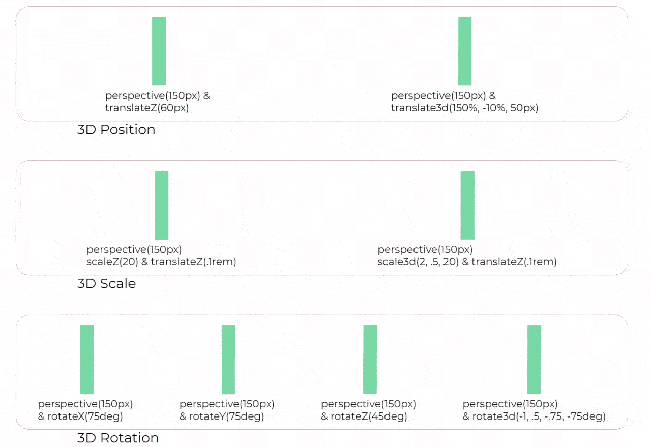
The transform property comes in two different settings,
- two-dimensional
- three-dimensional
Each of these come with their own individual properties and values.
Within this lesson we’ll take a look at both two-dimensional and three-dimensional transforms. Generally speaking, browser support for the transform property isn’t great, but it is getting better every day. For the best support vendor prefixes are encouraged, however you may need to download the nightly version of Chrome to see all of these transforms in action. The actual syntax for the transform property is quite simple, including the transform property followed by the value. The value specifies the transform type followed by a specific amount inside parentheses.
div {
  -webkit-transform: scale(1.5);
     -moz-transform: scale(1.5);
       -o-transform: scale(1.5);
          transform: scale(1.5);
}
Notice how the transform property includes multiple vendor prefixes to gain the best support across all browsers. The un-prefixed declaration comes last to overwrite the prefixed versions, should a browser fully support the transform property.
Transition and animation
One evolution with CSS3 was the ability to write behaviors for transitions and animations. Front end developers have been asking for the ability to design these interactions within HTML and CSS, without the use of JavaScript or Flash, for years. Now their wish has come true.
With CSS3 transitions you have the potential to alter the appearance and behavior of an element whenever a state change occurs, such as when it is hovered over, focused on, active, or targeted.
Animations within CSS3 allow the appearance and behavior of an element to be altered in multiple keyframes. Transitions provide a change from one state to another, while animations can set multiple points of transition upon different keyframes. As mentioned, for a transition to take place, an element must have a change in state, and different styles must be identified for each state. The easiest way for determining styles for different states is by using the :hover, :focus, :active, and :target pseudo-classes.
There are four transition related properties in total, including transition-property, transition-duration, transition-timing-function, and transition-delay. Not all of these are required to build a transition, with the first three are the most popular.
It is important to note, not all properties may be transitioned, only properties that have an identifiable halfway point. Colors, font sizes, and the alike may be transitioned from one value to another as they have recognizable values in-between one another. The display property, for example, may not be transitioned as it does not have any midpoint. A handful of the more popular transitional properties include the following.
- background-color
- background-position
- border-color
- border-width
- border-spacing
- bottom
- clip
- color
- crop
- font-size
- font-weight
- height
- left
- letter-spacing
- line-height
- margin
- max-height
- max-width
- min-height
- min-width
- opacity
- outline-color
- outline-offset
- outline-width
- padding
- right
- text-indent
- text-shadow
- top
- vertical-align
- visibility
- width
- word-spacing
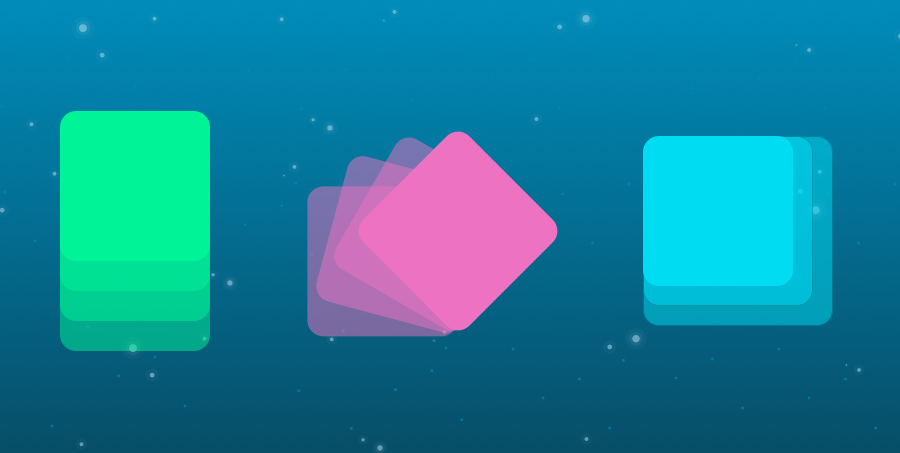
………………………………………………………………………………………………………………………………………………………………. ## Animation

Transitions do a great job of building out visual interactionfrom one state to another, and are perfect for these kinds osingle state changes. However, when more control is requiredtransitions need to have multiple states. In return, this iwhere animations pick up where transitions leave off.
To set multiple points at which an element should undergo transition, use the @keyframes rule. The @keyframes rulincludes the animation name, any animation breakpoints, and thproperties intended to be animated. The @keyframes rule must be vendor prefixed, just like all othe other transition and animation properties. The vendoprefixes for the @keyframes rule look like the following:
- @-moz-keyframes
- @-o-keyframes
- @-webkit-keyframes
……………
- fade:
Fade in Having things fade in is a fairly common request from clients. It’s a great way to emphasize functionality or draw attention to a call to action.
- Change color:
Animating a change of color used to be unbelievably complex, with all kinds of math involved in calculating separate RGB values and then recombining them. Now, we just set the div’s class to “color” and specify the color we want in our CSS:
- Grow & Shrink:
To grow an element, you used to have to use its width and height, or its padding. But now we can use CSS3’s transform to enlarge.
- Rotate elements:
CSS transforms have a number of different uses, and one of the best is transforming the rotation of an element. Give your div the class “rotate” and add the following to your CSS:
- Square to circl:
e A really popular effect at the moment is transitioning a square element into a round one, and vice versa. With CSS, it’s a simple effect to achieve, we just transition the border-radius property.
- 3D shadow:
3D shadows were frowned upon for a year or so, because they weren’t seen as compatible with flat design, which is of course nonsense, they work fantastically well to give a user feedback on their interactions and work with flat, or fake 3D interfaces.
This effect is achieved by adding a box shadow, and then moving the element on the x axis using the transform and translate properties so that it appears to grow out of the screen.
- Swing:
Not all elements use the transition property. We can also create highly complex animations using @keyframes, animation and animation-iteration.
- Inset border:
One of the hottest button styles right now is the ghost button; a button with no background and a heavy border. We can of course add a border to an element simply, but that will change the element’s position. We could fix that problem using box sizing, but a far simpler solution is the transition in a border using an inset box shadow.